Compatibility:
WebSite X5 Evo and Pro
Today, browsing from a smartphone has become the norm. More and more users visit websites from mobile devices, tablets, or screens with very different sizes. For this reason, designing a site only for desktop can significantly limit the browsing experience, making text difficult to read, content disorganized, and menus hard to use.
With WebSite X5, you can address this issue thanks to Responsive Design: a design approach that allows the website to automatically adapt to different resolutions, providing a more effective and professional display on any device.
What is Responsive Design
A responsive website is designed to automatically adjust the layout of its elements based on the available space.
This means you do not need to create different versions of the same Website because:
- the contents adapt to the available space;
- the Objects can reorganize themselves;
- texts and margins can adapt to different resolutions;
- menus and images are optimized for different screen sizes.
The goal is to always ensure clear and functional navigation, without forcing users to zoom or scroll in an uncomfortable way.
Why create a responsive website
Choosing a responsive design offers many advantages:
- improves user experience;
- makes the site more accessible;
- facilitates mobile browsing;
- contributes positively to SEO;
- avoids the need to create separate desktop/mobile versions.
In many cases, it represents the simplest and most effective solution for creating a modern project.
How to enable Responsive Design in WebSite X5
With WebSite X5, you can create responsive websites knowing that the program simplifies content management and fully handles the generation of the underlying page code.
To create a responsive website, follow these steps:
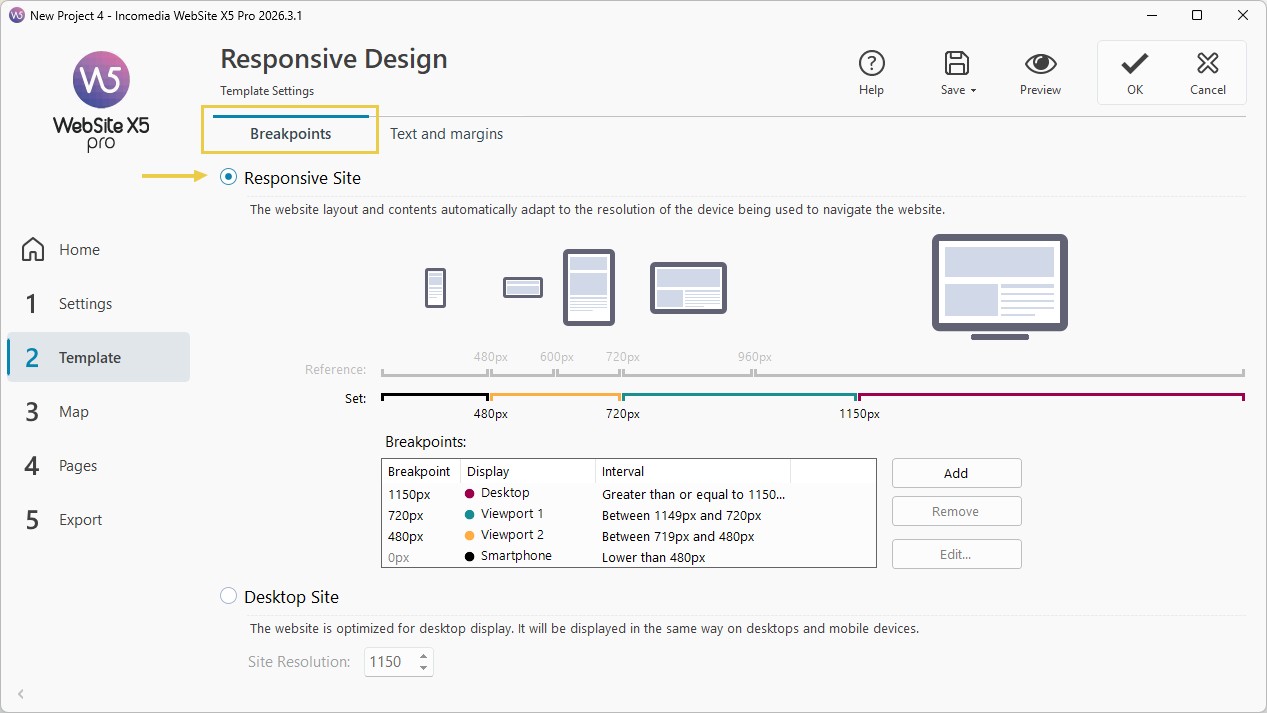
1. Enable Responsive Design
- Go to Step 2 - Template
- Open the Resolutions and Responsive Design section.
- Enable the Responsive Website option.
2. Manage breakpoints
Breakpoints define the resolutions at which the site changes its structure, allowing you to precisely manage desktop, tablet, and smartphone layouts. In practice, they represent the transitions between different views.
To configure breakpoints, proceed as follows:
- In the Resolutions and Responsive Design window, stay in the Breakpoints section.
- Check the proposed breakpoints. The graphic helps you visualize the breakpoints provided by default: you can also find them listed in the table.
- Use the Add, Remove, and Edit commands to define which ones you actually want to activate in the project.
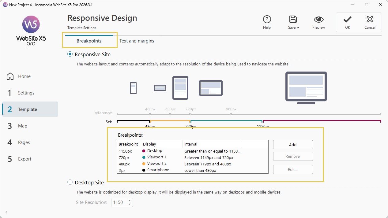
For example, you could set 3 breakpoints, one for:
- a desktop version for large screens;
- a tablet version for medium resolutions;
- a smartphone version for smaller screens.
#tip - For more information, see Breakpoints. How to correctly set resolutions for a responsive website?.
3. Optimize text and spacing
One of the most important aspects is text readability, which must also be ensured on smaller devices.
WebSite X5 makes this easier by automatically handling:
- proportional text scaling;
- margin adjustments;
- spacing between elements;
- line spacing;
- content distribution.
Operationally, here’s what you need to do:
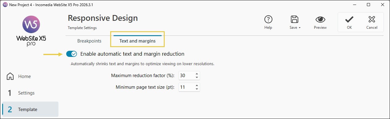
- In the Resolutions and Responsive Design window, switch to the Text and margins section.
- Enable the Enable automatic text and margin reduction option to optimize display when screen width is reduced.
#tip - For more information, see Text and margins. How to automatically optimize readability and spacing in responsive web pages?
4. Manage layout for each breakpoint
In addition to the Page contents, the Template elements must also adapt to the different resolutions.
To configure them:
- Go to Step 2.
- Open the Template Structure section.
- Use the Responsive Bar to select the different Views one after another.
- For each View, define how the Template elements should be displayed.
#tip - For more information, see Responsive Template. How to adapt the site layout to different devices?.
5. Manage page content for each breakpoint
The contents inserted on the Pages must also be able to reorganize when the available space changes.
To manage them:
- Go to Step 4 - Pages and create the Page for the Desktop View.
- Click the
 Responsive button to open the Responsive Settings window (see Responsive Contents. How do you manage Page contents and layouts at different breakpoints?). The contents adapt automatically, but you can make manual adjustments to fine-tune the result.
 - Use the Responsive Bar to switch from one View to another: start from Desktop and proceed through to Smartphone.
- In the Desktop View, click the
 Order button, then click the different Objects inserted in the Grid to define their order. Remember that if the Page is organized into multiple Sections, WebSite X5 manages the ordering of the Objects in each Section separately (see Responsive Object Ordering. How do you organize contents correctly in the different Views?).
 - If you want to hide some contents at specific resolutions, click the
 Show/Hide Object button and select the elements to exclude.
 - If you are using the Pro version, you can force some Objects onto the next row: click the
 Row Break button, then click the dashed lines between the Objects in the Grid where you want to insert the "line breaks" (see Responsive Settings. How do you create more flexible layouts with Row Breaks?).
6. Check site behavior
During design, it is essential to verify the final result.
- Click Preview to view the site in a local browser.
- Use the controls


 to simulate different resolutions, test all breakpoints, and verify content flow.
#tip - For more information, see Local Preview. How to verify the correct behavior of a responsive website?
Practical tips
To achieve an effective result, it is not enough to simply enable the available responsive features: it is important to design each page by considering from the start how content, images, and layout will be used on different devices.
Here are some practical tips to achieve an effective result:
- choose simple and well-organized layouts;
- avoid overly complex content on mobile;
- use optimized images;
- always check menus and buttons;
- check text readability;
- test every change frequently.
Paying attention to these aspects during design allows you to offer a more professional experience, improve user satisfaction, and make the most of every published content.
In summary
Creating a responsive website with WebSite X5 means designing a modern, versatile site suited to today’s needs, capable of offering effective navigation on desktop, tablet, and smartphone.
Thanks to breakpoints, advanced layout management, and preview tools, you can easily create a professional project without having to directly manage the most complex technical aspects: the program automatically handles layout adaptation, content redistribution, and the optimization of text and spacing.
Your task is mainly to focus on the quality of the structure, the organization of content, and the user experience, intervening manually only when necessary to refine the final result and ensure the best possible rendering on every device.