Compatibility:
WebSite X5 Evo and Pro
When creating a Responsive Website, defining an effective content hierarchy is essential. In fact, it is not enough to choose which elements to add to a page: it is equally important to establish how these contents should be reorganized when the available space decreases.
The goal of responsive ordering is to ensure that texts, images, and Objects maintain a consistent, readable, and functional arrangement even when switching from the desktop View to tablet and smartphone.
With WebSite X5, this is managed through the Responsive Settings window, where you can control the order in which the Objects will be adapted to the different resolutions.
Why Object ordering is important
Correctly defining the content order allows you to:
- establish priorities among the elements;
- improve readability and usability;
- avoid disorganized layouts;
- control linearization on mobile;
- make the layout more effective at the different breakpoints.
In practice, the order determines the behavior of the Page when the desktop structure can no longer be maintained within the available space.
Where to manage ordering in WebSite X5
WebSite X5 automatically assigns an initial order to the Objects, but this does not always correspond to the most effective solution. For this reason, it is advisable to check the proposed order and make manual changes when required by the content hierarchy.
To change the content order, proceed as follows:
- Go to Step 4 - Pages.
- Open the desired page.
- Click the
 Responsive.
 - Open the Responsive Settings window: it includes a Responsive Bar listing the active breakpoints.
- On the Responsive Bar, select the Desktop View: the Grid now shows the Objects, numbered according to their current order.
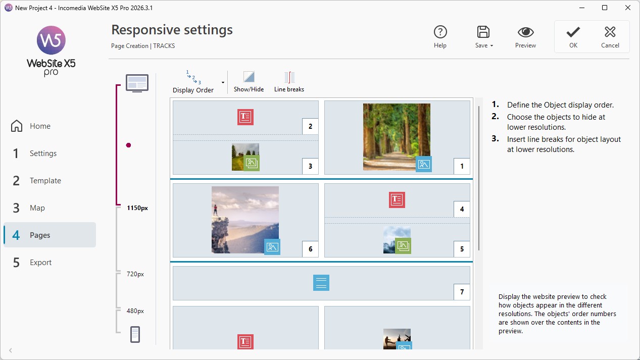
- Click the
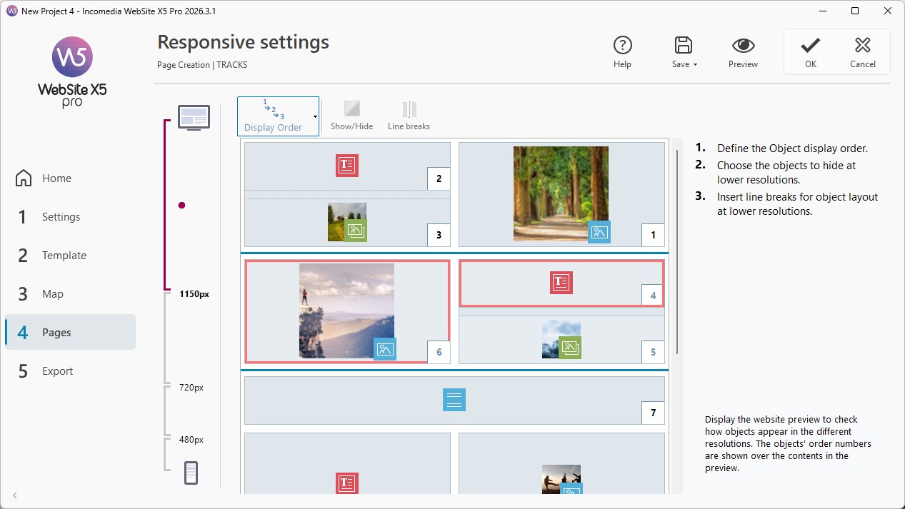
 Order button: the Objects become semi-transparent and those you can select are highlighted by a red border.
 - Choose the first Object among those highlighted and click to select it. The Object becomes completely opaque again and displays the number assigned to it in the order.
- Continue clicking the Objects following the order you want to use in the content linearization process. Each time, WebSite X5 highlights the Objects that can be selected next.
- If the initial series of Objects does not need to be changed, open the menu available from the Order button and select Continue ordering from an Object. Then click the Object from which you want to continue: all the preceding Objects keep the order already set, while you need to redefine the position of the following ones.
- To complete the procedure, you can:
- continue until you select the last Object;
- use the Order > Complete ordering command to end the procedure and confirm the current order;
- use the Order > Cancel ordering command to cancel the changes and restore the initial order.
#tip - The goal of the ordering process is to arrange all the Objects on a page so that they can be linearized correctly. WebSite X5 evaluates the possible sequences and highlights in red only the Objects that can be selected without creating discontinuities that would prevent the contents from being linearized correctly.
Ordering strategy
Depending on which Object you click and how the Objects are arranged in the Layout Grid, the available options for defining the next element change from time to time.
The behavior also depends on how you structured the Page: you may be working on a Page that is not divided into multiple Sections, or on a Page where you used multiple Sections to organize independent areas.
Case 1. Page not divided into multiple Sections
If you have not divided the Page into multiple Sections, WebSite X5 evaluates the flow of the Objects present in the entire Grid.
To better understand how it works, consider this structure:

Image 1. Starting structure
When you start the Ordering mode, the program highlights in red all the Objects in the first Row because these are the ones you can choose from as the first item in the list.
By clicking Object 1, the situation changes as follows:

Image 2. Click on 1: choose between 2, 3 and 4
The position of Object 1 is confirmed and WebSite X5 proposes Objects 2, 3 and 4 as the second element.
The one shown is only one of the possible orderings: depending on the content, it may be more correct to choose any of the other available Objects in the first Row as the first element.
Continuing with the example, let’s suppose we have confirmed the position of Objects 1, 2 and 3. The program now allows you to choose between Object 4 and Object 5.

Image 3. Choose between 4 and 5
This choice has consequences for the following possibilities. If you select Object 4, the result is a structure organized mainly by Rows; if you instead choose Object 5, the result is a structure organized mainly by Columns.

Image 4. Click on 4: row-based structure

Image 5. Click on 5: column-based structure
Case 2. Page divided into multiple Sections
If the Page is divided into multiple Sections, WebSite X5 manages the ordering separately for each of them: it first completes the flow of the Objects in the current Section and then moves on to the next one.
For example, suppose that a first Section contains Objects 1, 2 and 3 and that a second Section starts immediately after it.
If, during the ordering process, you have already selected Objects 1 and 2, WebSite X5 proposes only Object 3 as the next element, because it is the last one still to be ordered in the current Section.
Once you select Object 3, the ordering process moves on to the next Section and the program highlights the Objects that can represent the first elements of the new flow.
#tip - Sections simplify responsive ordering by dividing the Page into areas that are managed separately. For more information, see Page Sections. How do you create layouts with different structures?
Object Blocks
During the ordering procedure, Object Blocks can be created. A Block behaves as if it were a single Object and is drawn on the Grid as soon as it is formed, making the structure clearer.
In the previous example, by choosing a Column-based structure, Objects 1, 2, 3 and 4 form a Block, while Objects 5 and 6 form another one.

Image 6.

Image 7.
Images 6 and 7 show how different ordering choices can create different Object Blocks and, consequently, alternative Page structures.
In general, an Object Block does not necessarily remain a Block in all Views.

Image 8. Object Block in the Desktop View

Image 9. By hiding Object 4, the Block is no longer formed in the next View
In Image 8, for example, Objects 1, 2 and 3 form a Block because they are placed alongside Object 4, which spans both rows. However, as shown in Image 9, if you insert a Row Break between the Block and Object 4 (possible when working with the Pro edition), or if you hide Object 4, in the next View Objects 1, 2 and 3 are no longer placed alongside other Objects and therefore no longer form a Block.
If the Page is divided into multiple Sections, the ordering calculation is performed separately for each Section: the formation of Blocks is therefore also determined within the current Section.
Indivisible Blocks
When an Object Block remains a Block in all Views, except for the Smartphone View where the Page is completely linearized, and there is no way to break it up, it is defined as an Indivisible Block.
Indivisible Blocks are drawn on the Grid and highlighted with a different color from the one used for normal Blocks.

Image 10. Example of an Indivisible Block
In the example, the "flower-shaped" arrangement of the Objects does not make it possible to identify a Row- or Column-based structure. This significantly reduces the ordering options, does not allow Row Breaks to be inserted between the affected Objects (a feature available in the Pro edition), and does not allow a single Object to be hidden without automatically hiding all the other Objects in the Block as well.
When an Indivisible Block is formed, it is therefore advisable to check whether you can simplify the arrangement of the Objects in the Grid to gain more freedom in responsive management.
Pay attention to Empty Cells
When you create a new Page in a responsive Website, make sure there are no Empty Cells in the Layout Grid. The program treats Empty Cells as if they were (empty) Objects and assigns each of them a position in the ordering: these positions cannot be changed but will affect the ordering options available for the actual Objects. Therefore, to maintain the greatest possible freedom when ordering the Objects, it is better to avoid Empty Cells and insert empty Objects instead: if added manually, these empty Objects will not affect the Page composition and can be ordered.
Best practices
There is no single absolutely correct ordering: the best solution depends on the contents on the Page and the result you want to achieve in the different Views.
To avoid problems:
- first decide which contents should have higher priority;
- prefer simple structures that are easy to linearize;
- avoid overly complex arrangements when they are not necessary;
- check how Object Blocks are formed;
- where possible, limit Indivisible Blocks.
Finally, always check in Preview how the Page is displayed at the different breakpoints. If the contents maintain a coherent, readable, and functional sequence, the ordering you set can be kept.
In summary
Object ordering is one of the most important aspects of responsive design because it determines how the contents adapt to the different resolutions.
With WebSite X5, you can control this process visually, defining a more effective, readable, and strategic structure without working directly on the code.
Good ordering improves usability, flexibility, and the overall quality of the project.